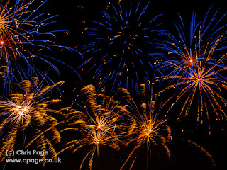
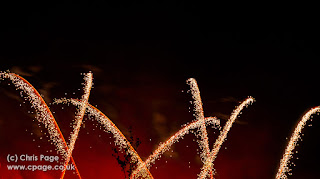
I feel these photos "come out well" and certainly display on screen with some impact.
The picture above is my personal favourite, the bursts of light almost look like dandelions on a sunny day.
There was a small amount of processing, a couple of pictures were cropped, having set the camera up and made minor adjustments at the beginning to try to frame the shots correctly I had to go with what I had set and hope; best will in the world the rear LCD, located somewhere near my knees, is only an indication at best and fireworks do their thing at various heights. You will the top of a small tree in a lot of shots, I had no idea that was there until loading up on the PC.
With regards positioning, I need a better position but whilst I was attending and taking photos I was also dressed in a hi-viz jacket (and I can tell you batman looked cooler in a hi-viz that I did, not something you see everyday) and manning the boundary to ensure no one strayed close to the fireworks.
With regards processing the changes I made were solely about making the pictures stand out.
I changed the colour temperature, not 100% consistently but most started at around 3000k on auto, I saw an online suggestion of using Daylight (5500k) but I found that over the top for the strength of colour (let's call the predominant theme tango orange) and generally was using 4000-5000 (my skills are truly amateur here, so I mean it was 4000 or 4500 or 5000).
I did have to tweak the tint a couple of times, it seems fireworks are predominantly orange so orange and red fireworks together become too dominant so I have tried to bring back a better range of colour, for some reason my pictures tended to be around +7 towards the pink end of the scale (I need to experiment with the camera, I am not sure whether that is a feature of my raw files or Lightroom).
Blacks were increased to make the sky blacker, the background actually looks across Burgess Hill to the West which the usual orange glow of street lamps so making the sky a little blacker makes the fireworks stand out better.
Highlights were reduced a little, recovering all of the pixels tends to make for a flat picture so some burn out of pixels, the centre of the firework explosion, seems acceptable to me but a reduction outside of that brings colours away from just white.
Clarity was increased, generally around +40 to really make the streams of sparks stand out.
I increased vibrance to somewhere around +3- which brings the colours out.
And a small increase, around +10, for Saturation gives strong colours, online advice was suggesting +20 but that just went straight to hurting my eyes.
The final alteration was sharpening, some of the pictures, indeed the majority are untouched but with such a lot of movement some needed a little sharpening to add some punch.
A couple I did also adjust the luminance setting for Noise reduction, around +10, just to reduce the noise I was seeing. Interestingly inspite of using the same settings throughout once the show was underway the amount of sharpening and consequent luminance adjustment varied but in practical terms I am not sure that shows on the final output one way or another; so that is something else I need to work on, improving my appreciation of what the final picture will look like at each stage of change.
The bonfire society will be back next year, to keep up to date visit their Facebook page.


No comments:
Post a Comment